
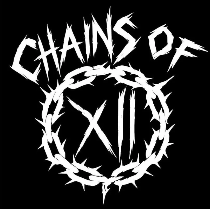
Chains of XII Branding
Designed a bold, aggressive visual identity for an alternative rock band, using sharp, chain-inspired forms to reflect intensity, cohesion, and raw energy. The system was built to scale across album artwork, merchandise, and digital platforms, ensuring a consistent and impactful brand presence.
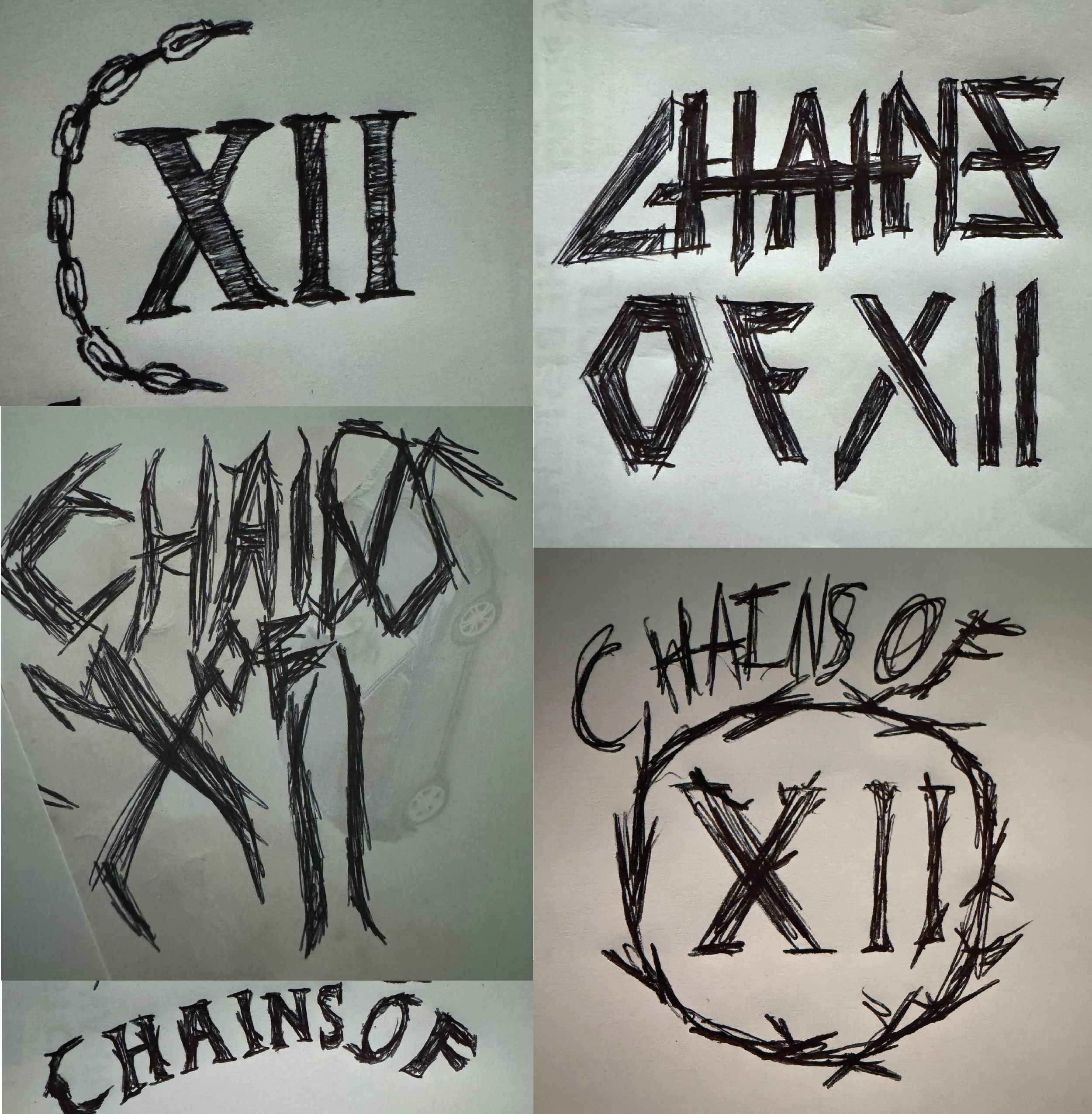
Early Design Concepts.
These early sketches capture the exploratory phase of the process, where ideas are quickly translated onto the page without over-restriction. This stage allows concepts to evolve organically, helping identify what feels strong and worth developing further. For this project, the focus was on integrating chain motifs, gritty textures, and a raw, grunge-inspired aesthetic to reflect the visual language commonly associated with metal and hard rock bands.
Digital Exploration
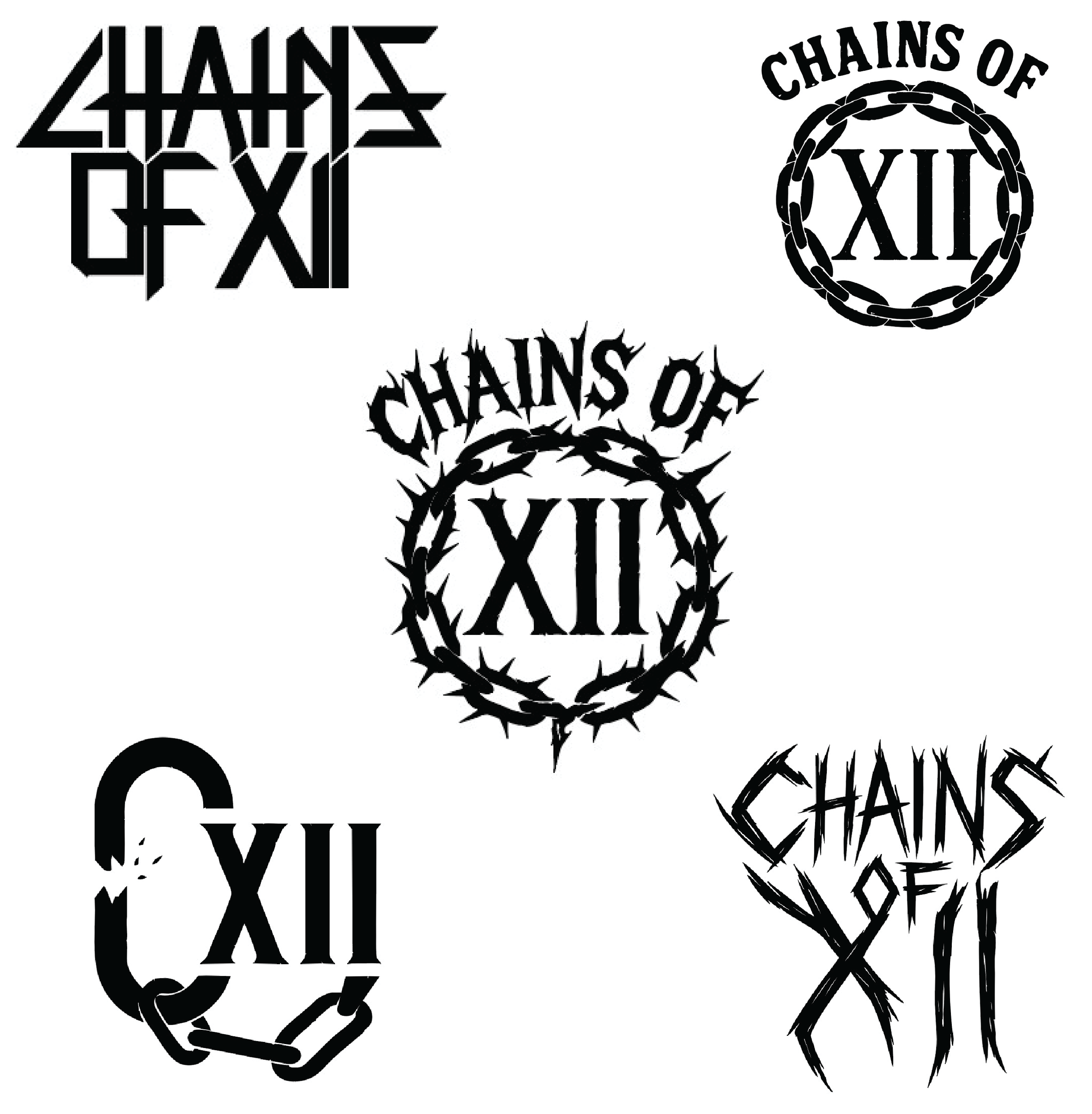
After the sketching stage, I move into digital exploration, selecting the strongest concepts and translating them into digital form, often using industry-standard design tools within the Adobe suite. This phase focuses on refining structure, typography, and visual details, while also allowing room for new ideas to emerge, often leading to the final direction seen above at the beginning of this page.
Merch Design
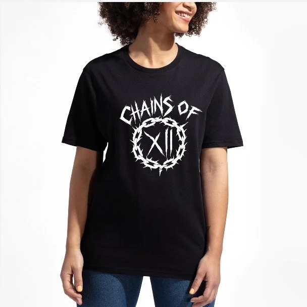
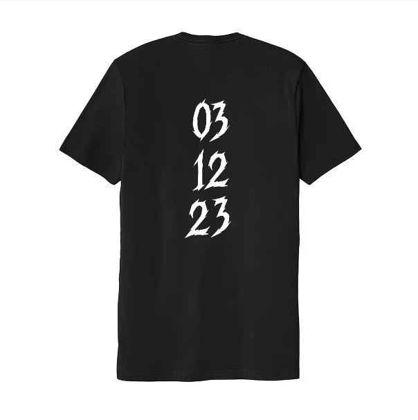
Alongside the logo and brand identity, I created sample merchandise to show how the visual system could extend into real-world applications. The name Chains of XII represents the band’s connection to one another, with each member linked through their shared birth month December, represented by the number twelve. To reflect this concept, the back of the merch features the band members’ birth dates running vertically along the spine, visually connecting them. The typography mirrors the style used in the logo, reinforcing cohesion across the brand.
To extend the identity into motion, I created a short animation that brings the chain elements to life, reinforcing the band’s intensity and adding energy to the visual system.