
Serenity; Branding Project
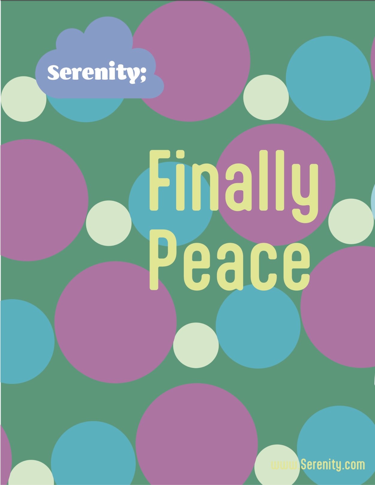
This project focused on branding a concept that is inherently difficult to define: anxiety. The goal was to create a brand centered on support, comfort, and the promotion of positive mental health. I began by identifying the core purpose of the brand to provide a safe, welcoming space where people could seek help, learn, and feel supported through their struggles.
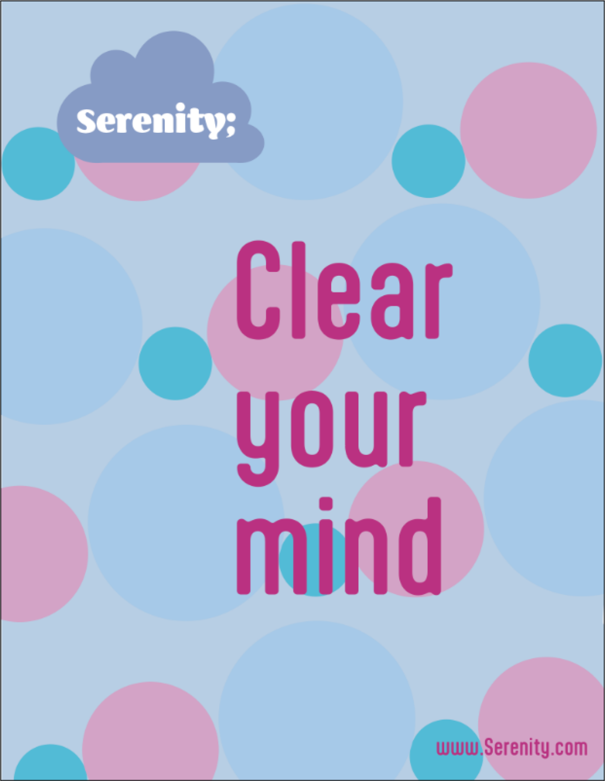
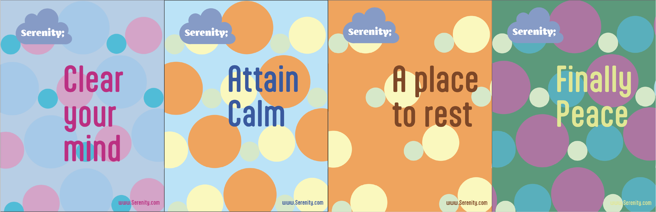
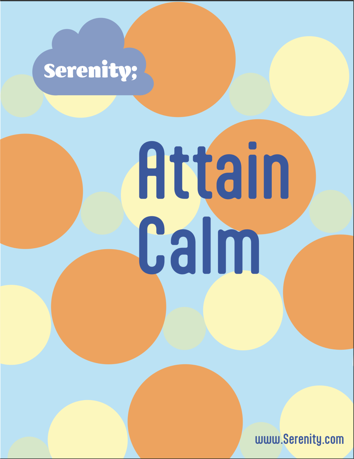
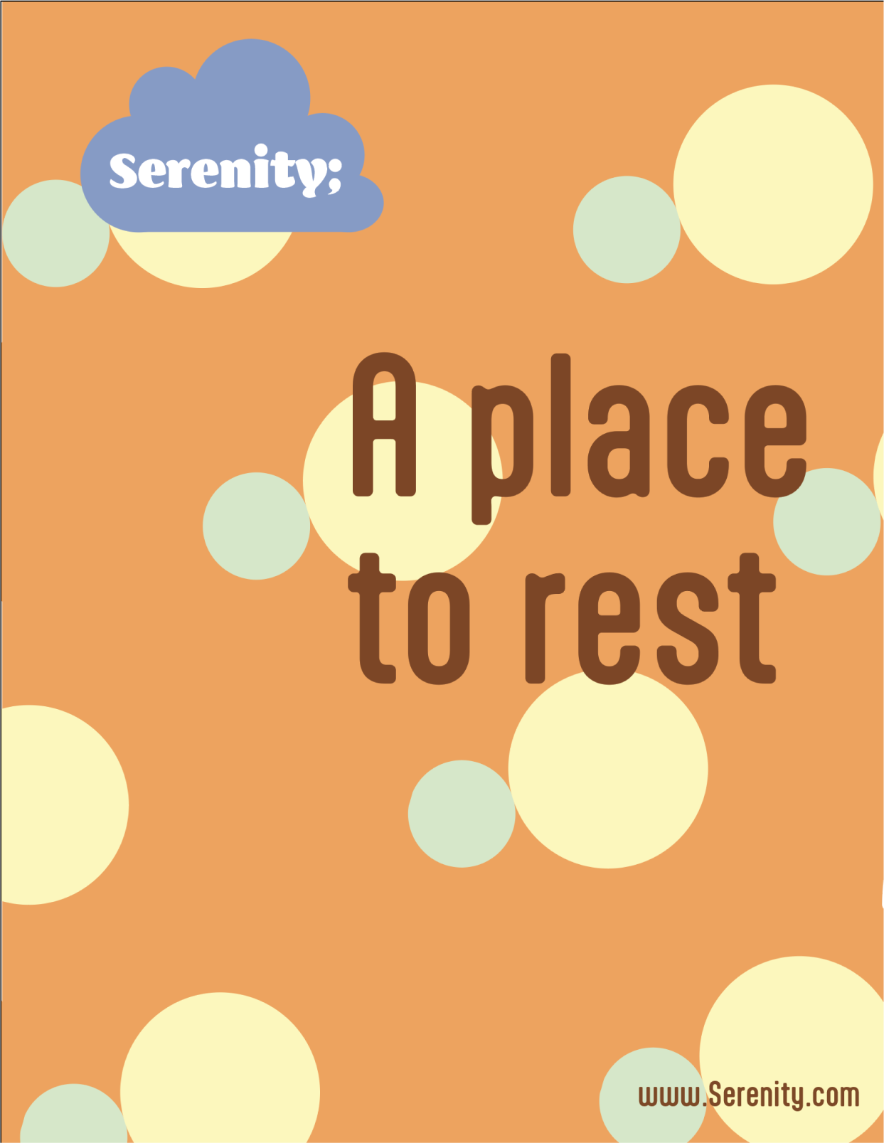
From there, I explored what could represent the opposite of anxiety. While difficult to define, this concept ultimately led to themes of serenity and inner peace, which became the foundation of the brand’s identity. Using soft imagery and calming colour palettes, I designed a visual system that felt approachable and reassuring. The project included the development of a logo, supporting posters, and a website designed to invite users to engage, learn, and find support.
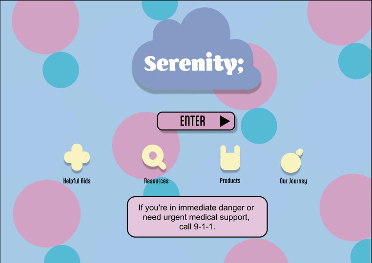
Serenity Web App
The web app served as a continuation of the Serenity brand and was developed as the final project for my UI course at BrainStation. I designed a web application aimed at helping individuals struggling with mental health find accessible support and resources. The project involved the complete design process, from initial wireframes to a fully clickable prototype, which can be viewed below.
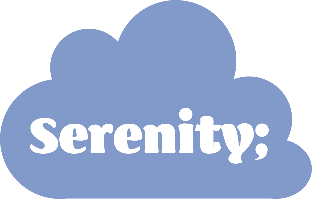
About The Logo
The Serenity logo was created as part of a project focused on designing a supportive and approachable space for individuals experiencing anxiety. The visual direction aimed to feel welcoming, soft, and non-intimidating, reinforcing a sense of calm from the first interaction. Research into colour psychology informed the use of blue and pastel tones, which are commonly associated with relaxation, comfort, and emotional balance. The lighter palette helps create a gentle, reassuring presence rather than something clinical or overwhelming.
The typography was intentionally rounded and playful, using soft, bubbly letterforms to further reinforce warmth and approachability. A semicolon was incorporated into the logo as a widely recognized symbol within mental health communities, representing continuation rather than an ending. Just as a semicolon continues a sentence, the mark reflects the idea of moving forward, aligning with Serenity’s purpose of offering support, hope, and encouragement to those seeking help.