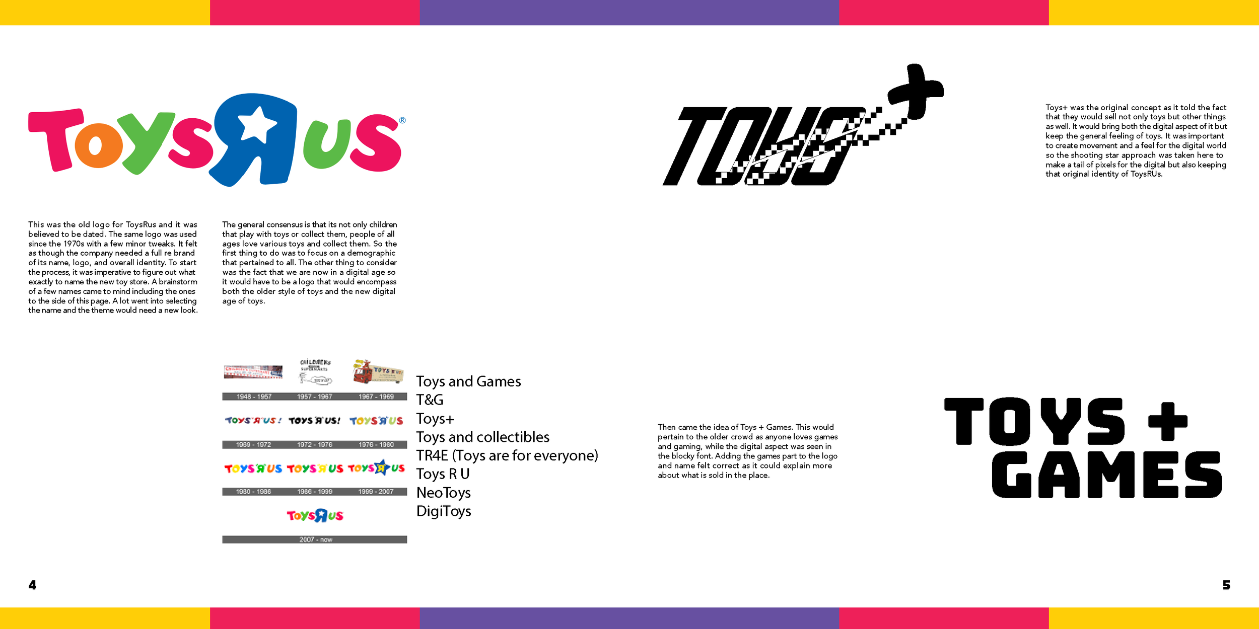
Toys Games
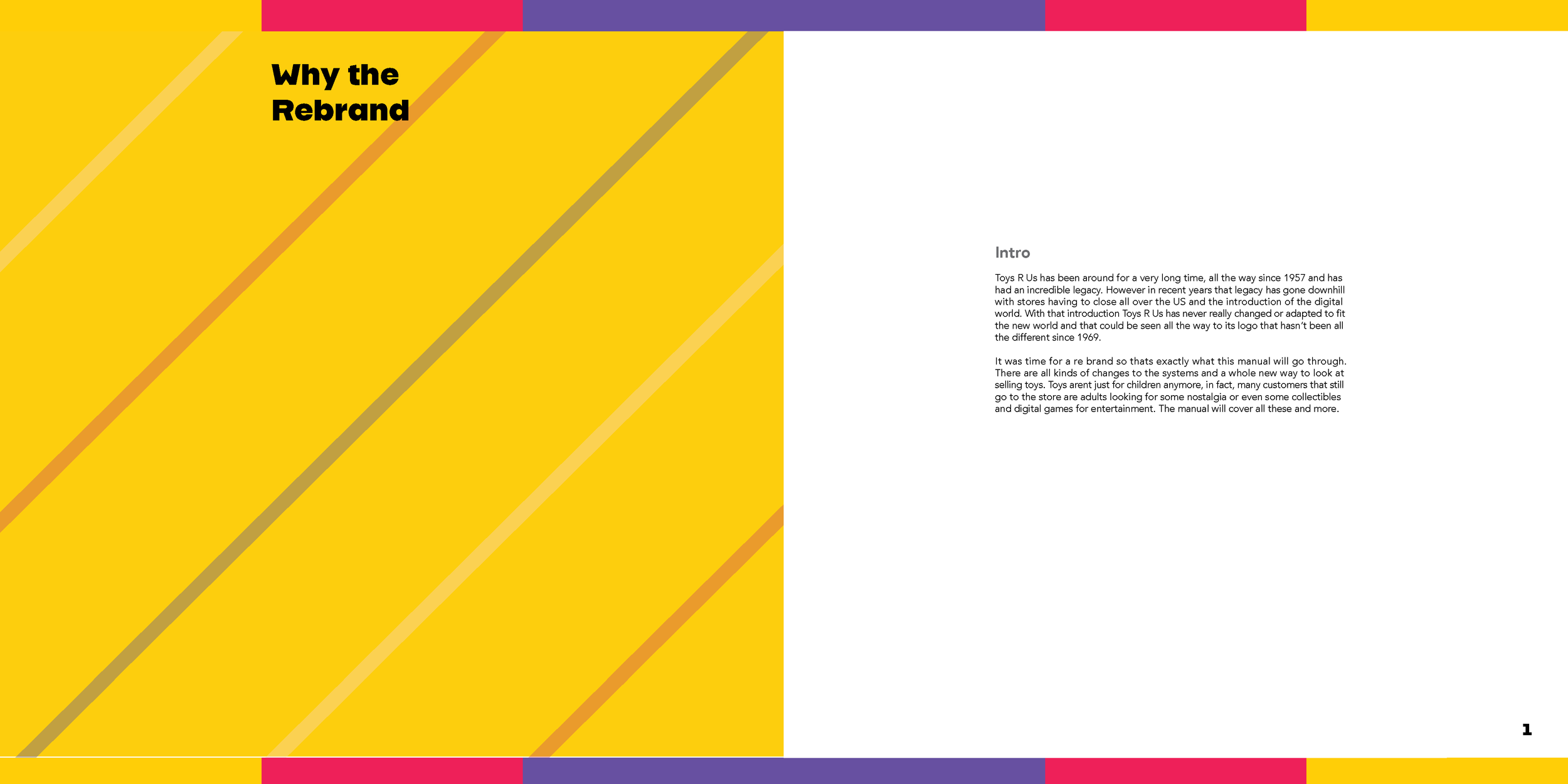
This project is a conceptual thesis exploration, using Toys“R”Us as a reference point rather than an official rebrand. The goal was to reimagine the brand as a space for children, teens, and adults built around the idea that play and games are not limited by age.
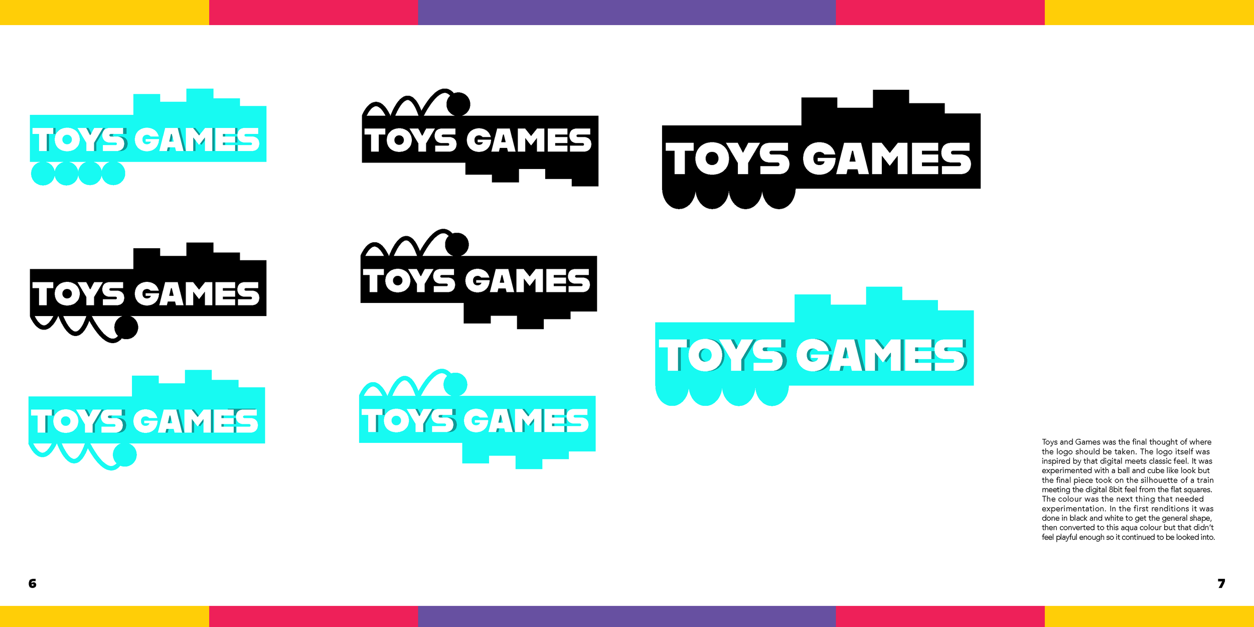
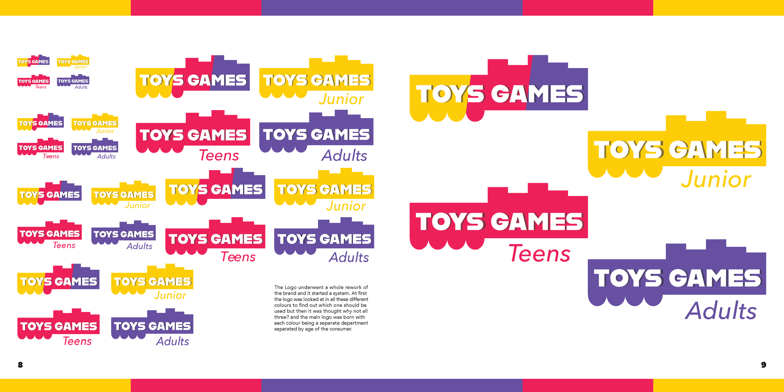
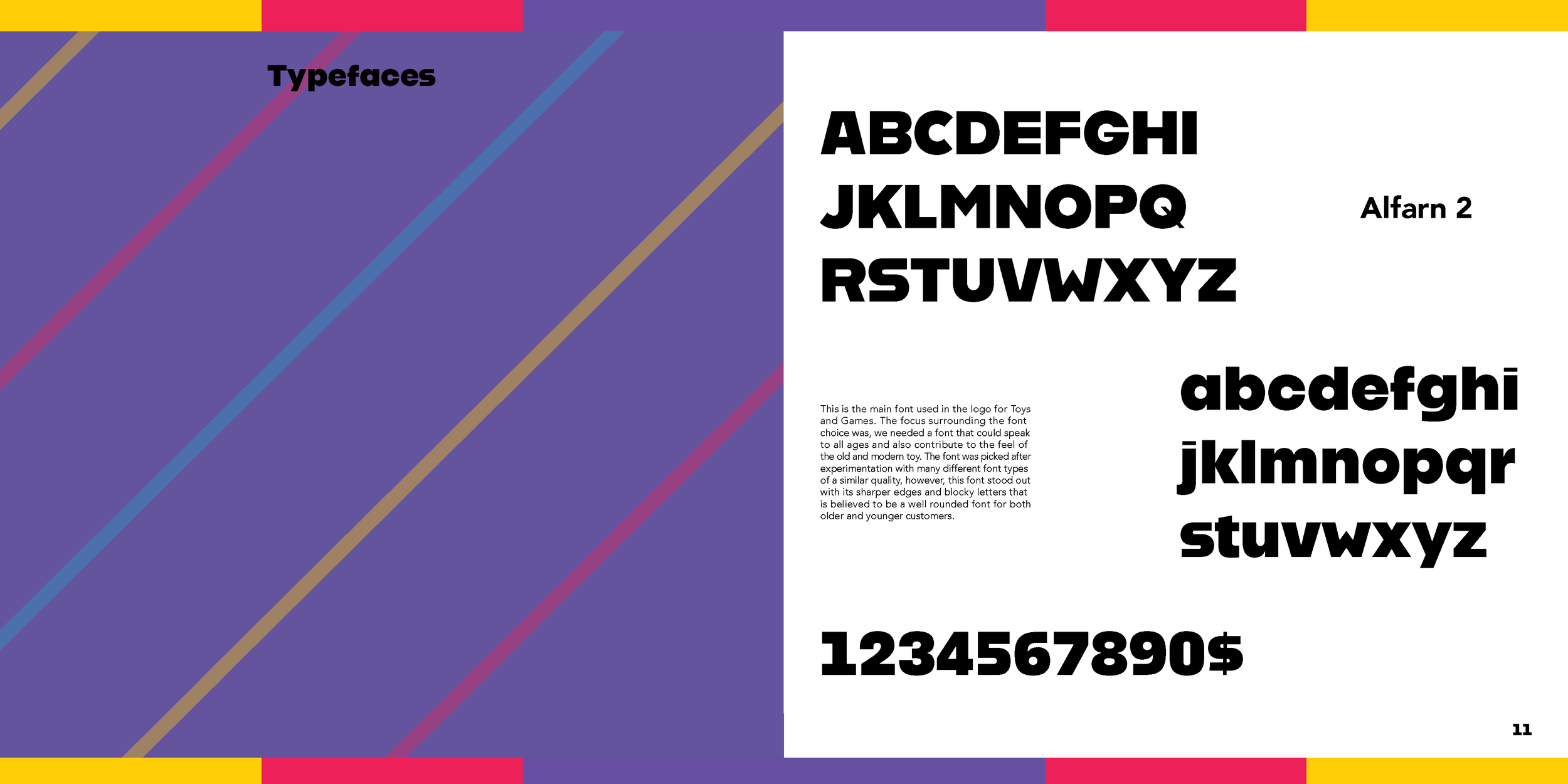
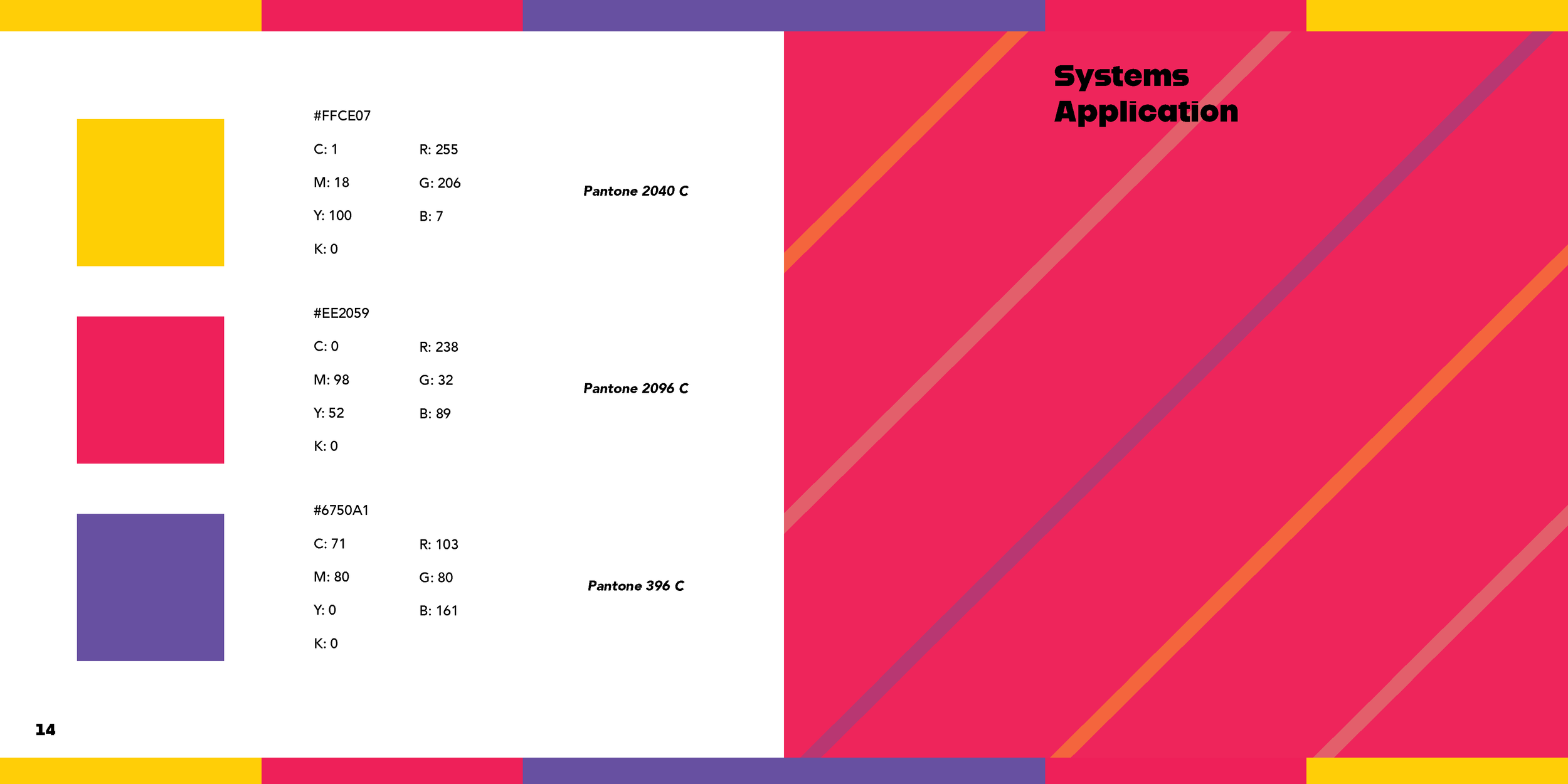
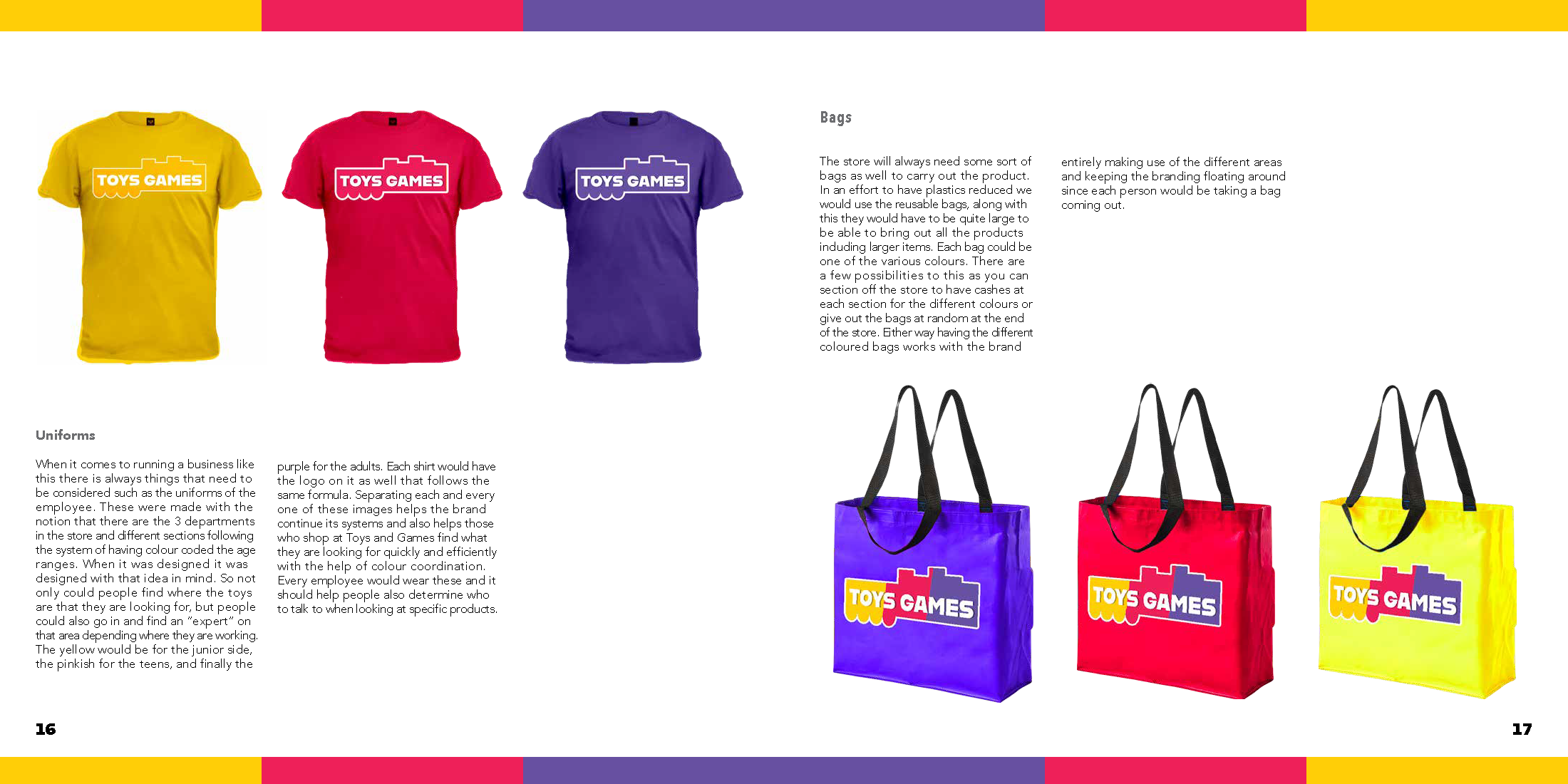
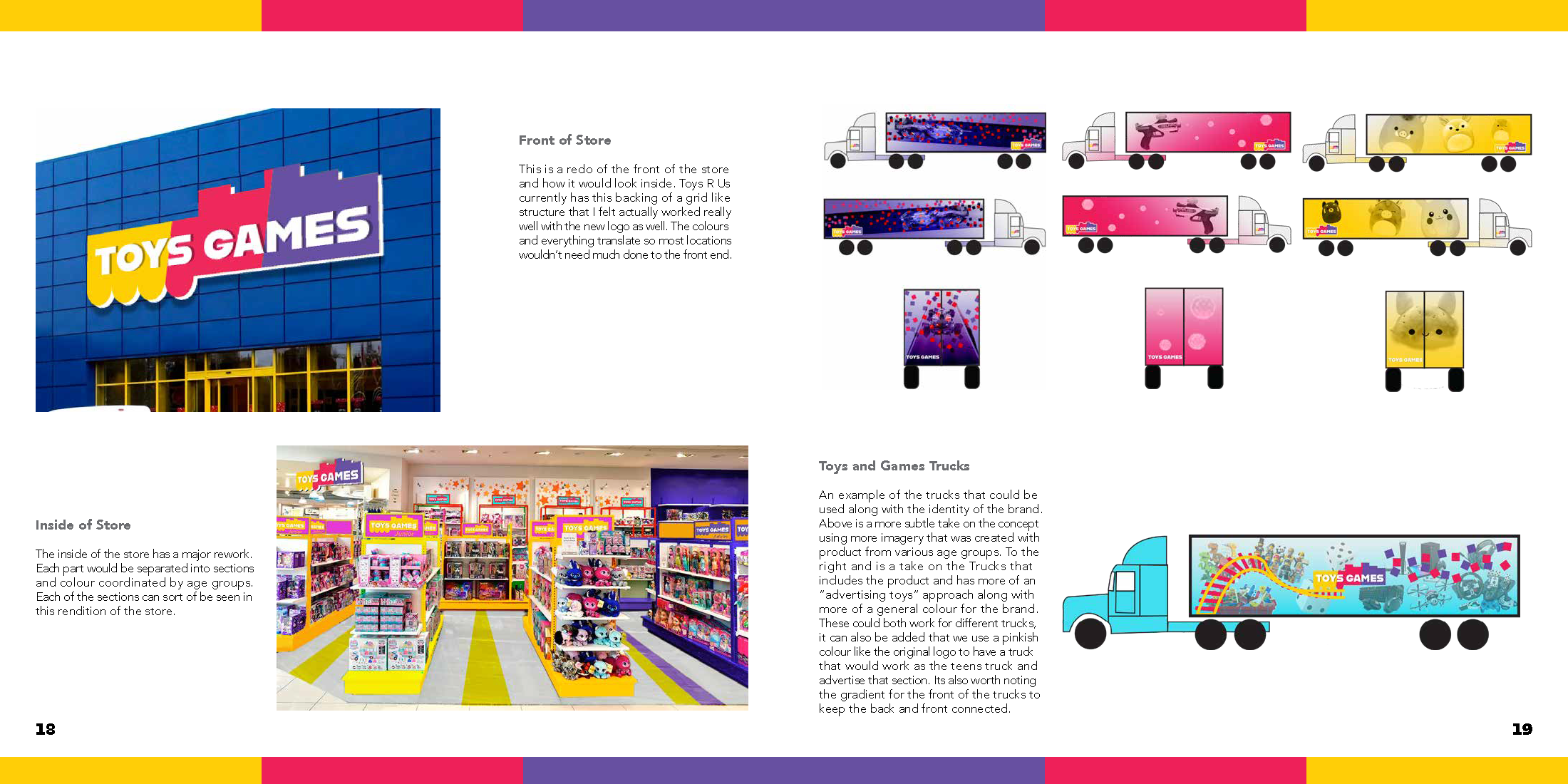
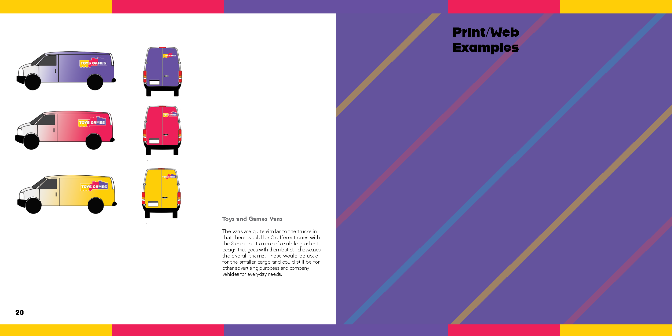
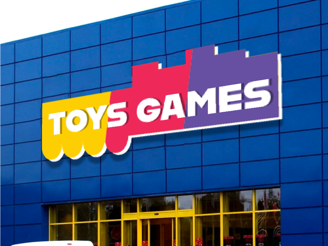
The identity was adapted to Toys & Games to reflect a broader audience and the evolution from traditional toys to modern and digital play. The logo combines classic toy-inspired forms with pixel-based elements, bridging nostalgia with contemporary gaming culture. A bold, block-style typeface was selected to appeal across age groups while maintaining a playful yet structured feel. Colour was used as a system to distinguish audiences: yellow for juniors (0–10), pink/red for teens (11–17), and purple for adults (18+).
Graphic Standard Manual
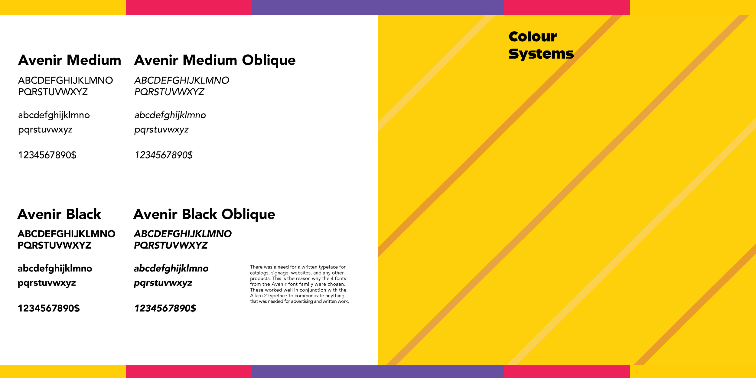
A graphic standards manual is a structured guide that defines how a brand or product is visually represented to ensure consistency across all platforms. This manual outlines logo usage, typography, color systems, layout principles, and visual hierarchy for Toys and Games while also documenting the development process behind the brand. It not only establishes clear design rules but explains the reasoning behind key decisions, detailing how concept, audience, functionality, and brand personality informed the final visual direction. Browse the full graphic standard manual using the navigation arrows below.