
Zurita Design Brand Identity
The Zurita Design brand was developed with a focus on structure, clarity, and adaptability across mediums. While the identity appears largely monochromatic, this decision was intentional. A strong logo must function effectively in black and white before colour is introduced, ensuring flexibility across print, digital, and environmental applications. By limiting colour, the focus shifts to form, geometry, and visual structure, allowing the underlying system to remain clear and legible. The final mark is the result of multiple iterations, including explorations with colour, ultimately refined into a geometric monogram that emphasizes the relationship between the “B” and “Z” forms.
This approach also reflects my personal design sensibility, one rooted in simplicity, contrast, and structure values, that consistently influence both my visual work and personal style
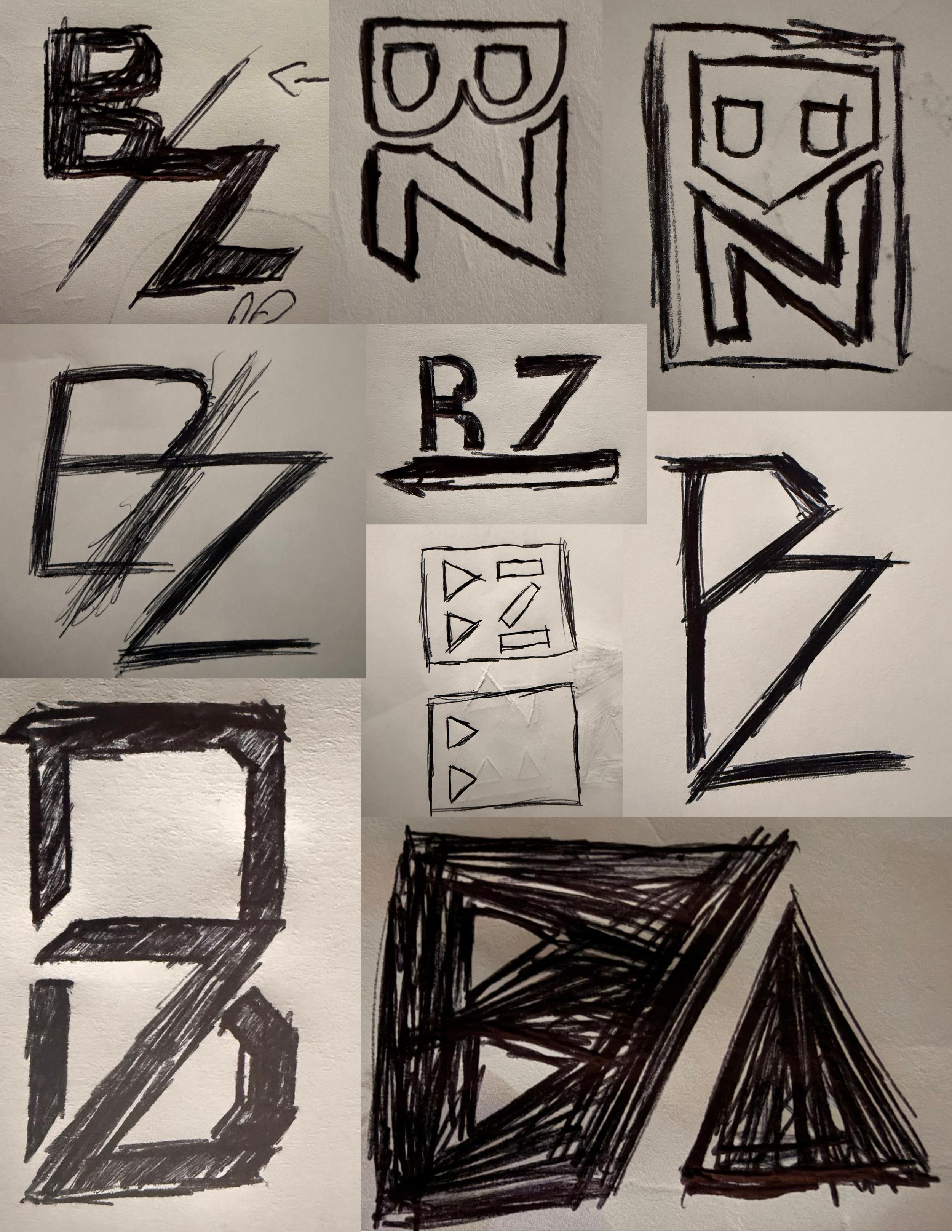
Sketching Phase
This phase explored geometric forms and compositions with an emphasis on positive and negative space, structure, and balance. Concepts focused on how contrast and emphasis could be achieved through form alone, helping inform later decisions around refinement and execution. These sketches established the structural foundation for the identity before transitioning into digital development.
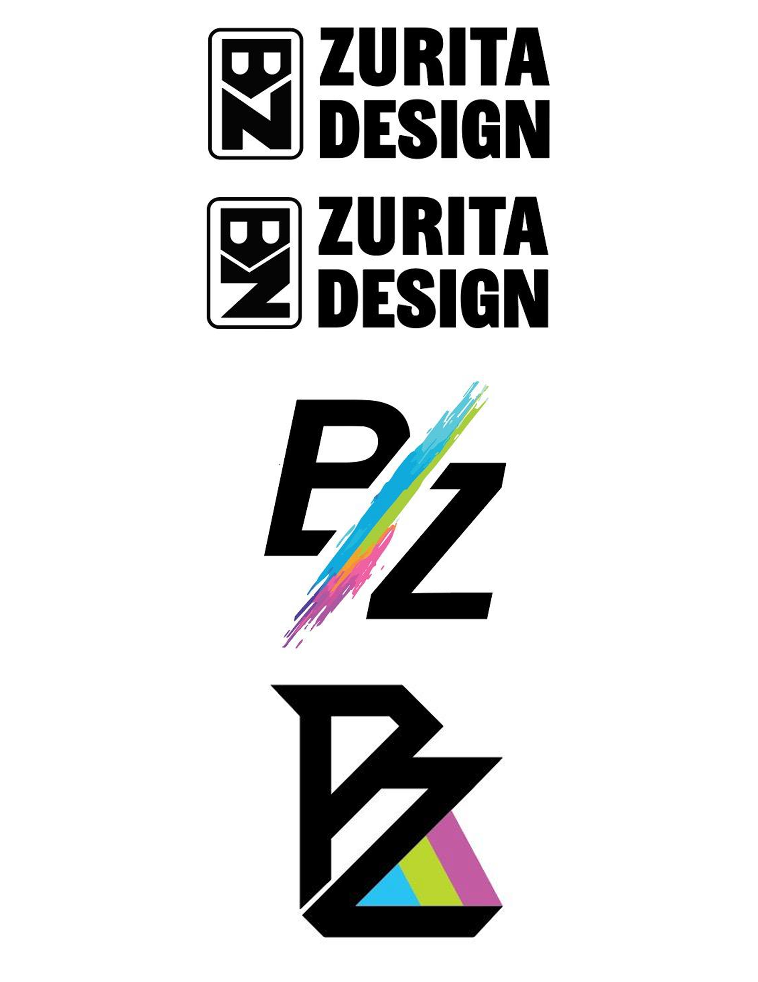
Digital Exploration
The digital exploration phase translated selected sketch concepts into refined compositions, allowing for greater control over geometry, spacing, and proportion. Colour was introduced selectively to explore contrast, hierarchy, and areas of emphasis within the mark. These iterations tested how colour could enhance clarity without competing with the form itself. Through this process, it became clear that reducing reliance on colour strengthened the visual impact of the shapes, ultimately guiding the identity toward a more restrained, monochromatic direction.
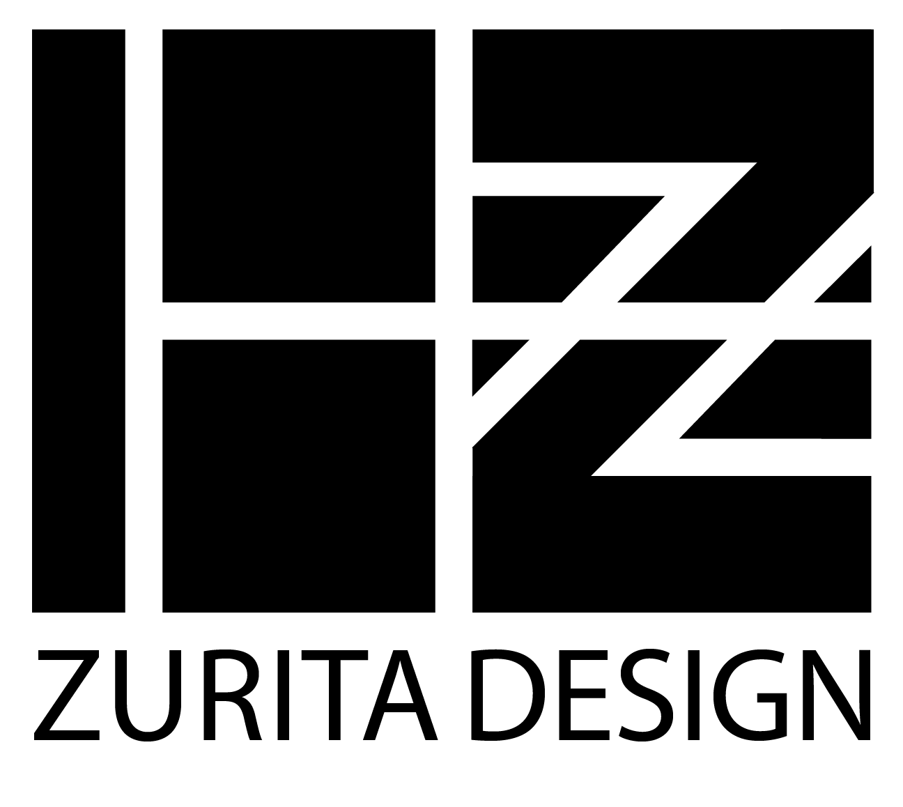
Final Identity
The final Zurita Design logo distills the brand into a bold, geometric monogram built around clarity, contrast, and balance. Constructed from simple shapes and consistent proportions, the mark integrates the “B” and “Z” letterforms into a unified visual system that feels intentional without unnecessary detail. The monochromatic execution reinforces versatility and longevity, allowing the logo to perform consistently across print, digital, and environmental applications. By prioritizing form and contrast over colour, the identity remains clear, adaptable, and immediately recognizable at any scale.